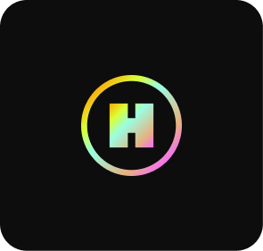
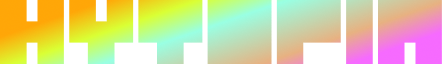
Primary Logos
Need anything that's not here? Email brand@hytopia.com
 PNG
PNG
 SVG
SVG
 SVG
SVGExamples:
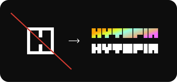
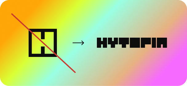
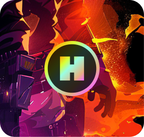
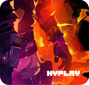
Good
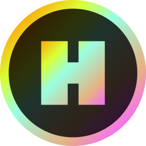
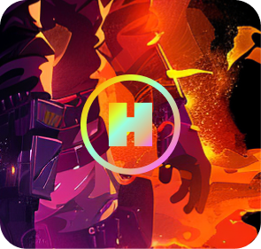
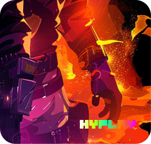
Bad
Colors bleed together.
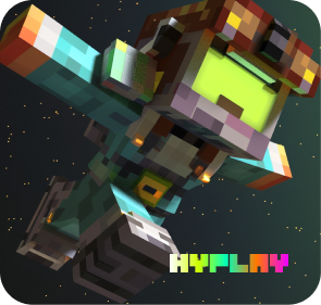
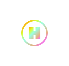
Good
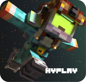
Good
Avatars + Icons

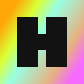
Square (primary)
Use this as the default brand mark. It should be the first choice wherever a square format is supported.
 PNG
PNG
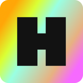
Rounded-Corner (Social Media)
Use this for social platforms where profile images are displayed in rounded-corner frames. This version prevents cropping and keeps the logo looking clean.
 PNG
PNG
 PNG
PNG
Examples:
Bad
Sometimes an all white icon is needed, however, we don't ever use a white icon/avatar, instead when this rare occurrence happens, use the full "HYTOPIA White" or "HYTOPIA Full Color" logo.
Colors
The only gradient fade on HYTOPIA is the diagonal fade.
Diagonal Fade (For Icon)
The gradient almost always goes from top left corner to bottom right corner.
Typography
Inter Bold
abcdefghijklmnopqrstuvwxyz
ABCDEFGHIJKLMNOPQRSTUVWXYZ
1234567890!@#$%^&*
Inter Bold
This is the main font for most headlines, titles, and button text. The sizes range from 36, 28, 20, 16, 14, and 12.
 Download Inter Bold
Inter Regular
abcdefghijklmnopqrstuvwxyz
ABCDEFGHIJKLMNOPQRSTUVWXYZ
1234567890!@#$%^&*
Inter Regular
This is used for body text, descriptions, and secondary content. The sizes range from 16, 14, 12, and 10.
Download Inter Regular$HYBUX Icon
 SVG
SVG
 SVG
SVG
 SVG
SVG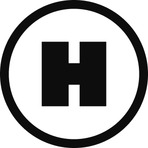
 SVG
SVGExamples:
Good
Bad
Colors bleed together.
Bad
Too hard to see.